The time has come for you to finalize your author brand: it’s time to choose your headshot, the depiction of you that will be printed into the back of your book with your biography, the version of your face that every reader who reads cover to cover will see.
That’s a lot of pressure.
How do you choose? Which pose should you use? How do you present yourself well?
Choosing a good headshot to use as your author photo is an important part of your branding, almost as vital as your book cover.
I created a video over on my YouTube channel to help walk you through this with visual examples, but if you don’t have time to watch the whole video, perhaps this list will help narrow down your options.
A good author photo has a five key components:
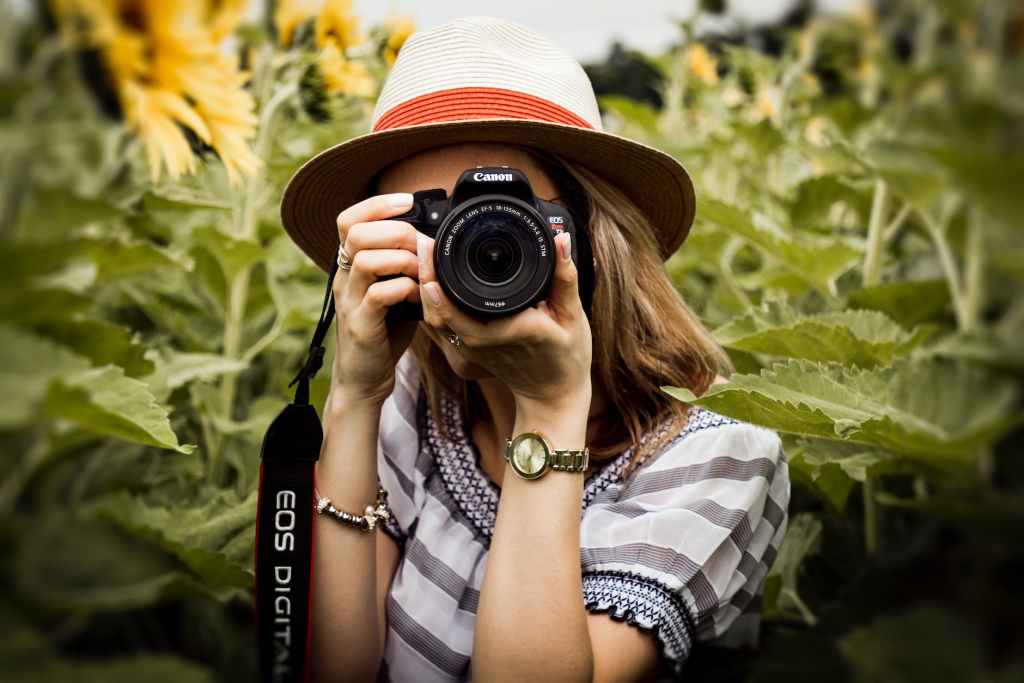
- Your face is unobstructed by shadows, hats, props, or stance.
- You look friendly and approachable.
- This is a high-quality headshot, featuring you from a straight-on perspective and limited to your shoulders and up.
- The background is not too busy and, in general, a light color.
- You love this photo and are very happy it will be shared publicly with the media and the internet.
If you have a decent camera, you don’t need to go to a portrait session. Truly, finding a simple white wall and standing in front of it with good lighting and a friend or a tripod to help you get a solid photo will do just fine.
Now that I’ve given the list, let’s talk a little about why that list is important. Why not use a dark background? Why can’t you be wearing a hat when your vacation photos are your most recent good pictures? Why shouldn’t you take a photo in front of a bookshelf, or leaning on a table? And how do you fix all those things without hiring a professional?
First things first, you absolutely can hire a professional if that would make you feel more comfortable. My only advice is to avoid any photos that look like they came right out of an elementary school yearbook. These will work in a pinch, but is anyone truly their most authentic self when a stranger is behind the camera? This photo is your representation of you to the world at large. Do yourself the favor of getting it right.
Don’t use a photo from your vacation.
Unless you are on vacation and intentionally taking a photo to use for your author headshot, repurposing a vacation photo will not have the desired effect. There’s a high probability you’ll be sunburned, wearing sunglasses, sweaty from an outdoor hike, rosy-cheeked from the hotel’s free mimosas, or your clothing won’t be professional. You can have a fantastic photo in all regards and then realize you have a camera strap around your neck and it can ruin it. This photo will be used for media purposes as well as printed in the book, so keeping it professional and simple is the best way to go.
Save the vacation photos to post on your social media. Don’t have it be your public image.
Don’t use a photo with a busy background.
As an author, it’s tempting to use a photo of yourself in front of books—your books, your favorite books, your extensive personal library, or a public library. Fight that urge. Book covers, by manner of being designed to draw attention, will draw the attention away from your face. That much text and color behind you will complicate the printing process and distract from the goal of the photo. It is far better to go outside at dusk and take a photo standing against the trunk of a tree than to to use anything as geometric as standard red-brick walls or bookshelves. Texture is good—natural rock texture or the porous look of cement, or the calm shades of green of leaves in the distance. But harsh lines will result in an odd pull of attention away from the main subject: you.
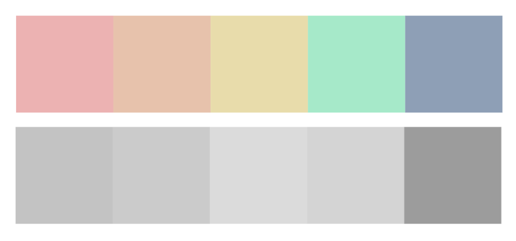
Consider how the photo will print and look in black and white.
This is also important because the interior of books, and many newspapers, still use photos in black and white. Whatever photo you provide needs to look good in thumbnail size in black and white without being too distracting. This is also why a dark background is not recommended, as that will create a black smudge on the page around your face (and, if the ink isn’t fully dry, the pages ahead of the photo).
Bright colors can work for this, but lighter variations are always better. Red, yellow, orange, pink, or peach all work well (they all turn to lighter shades of gray in black and white). Darker colors need to be in their lightened forms (baby blue rather than navy, for example, or lilac rather than royal purple).

Lastly, it’s important to look friendly and approachable because you want people to like you. If they like you, they’re more likely to take a chance on your books. You can be less friendly and less approachable once you’re as well-known as Stephen King or James Patterson, but until then, you’ll be better off using a photo that paints you in a friendly light.
Good luck out there! Picking your author photo means you’ve made great progress in your career. If you want help with this (or anything else marketing-related) I’d love to chat. Check out my services to see how we can work together.
Jori Hanna is a writer and marketer from Denver, Colorado. She graduated from Taylor University with a degree in Professional Writing and loves working with authors to help them reach their full potential. Check out the Services tab to see what she can do for you. Follow her on most social media @authorjjhanna and @jjhannaacademy.

Leave a comment